Monday, 7 December 2015

Dress experiments

Dress Print Experiments

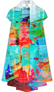
I have used the dress template to import my print onto it so that I can have an idea of what they might look like when they are finally done.

This print is a zoomed in image of a drinking glass, this image was originally red however I have used Photoshop to turn it to a aqua colour. I like the way it looks neon, I believe this resembles LED lights that can be seen mostly in night clubs and bars which fits in perfectly with my theme of night life. The tones in this print make it look slightly holographic also which creates an interesting edge to the print.


I really like the colours in this print because they all compliment each other really well. The slight hint of the photograph of the deer is effective as only a slight bit of it needs to be featured for example the deer's eye and nose can be seen quite clearly whereas the rest of it is obscure, however this looks better than being able to see to whole deer. To create this print I also used the print that I made using the bottom of a drinking glass and acrylic paints. I have then changed the colours using Photoshop before I did that the colours I used were mainly primary colours however I want to have bright colours in my print.
 This is the same print as the one before however I have used Photoshop to make the tones of the print darker. I prefer the brighter colours to this one as I don't think that these colours reflect my night life theme. In the print however, I did not change the colour of the deer it is the original photograph that I have used.
For this print I used the image of the first print that I used of the blue glass of vodka and cranberry juice. However I have also used a print that I created myself using water based paints and making them the shape that they are by using a straw to blow on them which made the paint spread into various shapes. I have also changed the colours of this to make them more bold and vibrant as I believe that this compliments the image of the blue glass behind it more than if they were left their original colour.
This print consists of an image I took when I was out on a Saturday night in Liverpool city centre. I believe that I have captured movement in this image with the couple walking and the bright lights of the night clubs and the flashing LED lights they all have. I have also used a line drawing that I created using a shot glass and outlining it using a red and orange fine liner pen, however this is very faint and can only really be seen by where the woman on the photo is. I have also made the images look more vibrant in this print using Photoshop.

I really like this print because I have only used the prints that I made using acrylic and fine liner pens. The round print was created using the bottom of a drinking glass and I dipped the bottom of this in different coloured acrylic paints such as red, yellow and blue. The other print I used was a line drawing using black and red fine liner pens, I used a shot glass and draw around it numerous times to give this effect, I used the same technique with a straw. I have given both of these prints different tones and colours with a black background to make the shapes stand out more.
This print features the deer again however only the eye and a small bit of body can be seen behind the other prints that I have used, the colour of the image has only been changed slightly however it's not very obvious. I have also used the image of the glass of vodka and cranberry juice which can be seen faintly on the left hand side of the dress. The colours in the dress are quite subtle compared to my other prints, it doesn't really reflect my night life theme.
This print contains one large image of the glass and then smaller versions of the image of the glass have been replicated four times. I think it would've looked more appealing if I blended the harsh lines out between each image. I have used really bright and vibrant colours in this print, the contrast of lighter and darker colours such as the dark blue and the bright aqua blue are also really effective.
This print is very similar to the second print I have chosen to talk about, however it is more opaque than the other one. The deer is lighter and more difficult to see than the other print and the colours aren't as bold, however I still really like this print.  I don't really like the harsh lines that can be seen I think that it would've looked better if they weren't there. 
I really like this print because of the colours and different shades of pink that have been used. I have used the deer in this and the print I created using the the bottom of a drinking glass and acrylic paints. Although the colours used look appealing, they don't really reflect my night life theme, as I am looking to create a print with more red tones which are slightly more vibrant.
This print contains the image of the deer and the print I made using the bottom of a drinking glass and acrylic paints. The subtle and soft tones of this print don't exactly fit in with my theme therefore I haven't decide to use this one as my final print. The picture of the deer hasn't been adjusted, the opacity has been increased slightly, and the other print I used has also been changed slightly only the outline of the rings can be seen, the colours are also more softer than the original print.

My Final Print


My final print


Context:
Prints in the fashion industry help businesses keep up with fast fashion whilst still creating unique and high quality prints, using software such as Photoshop and Illustrator. These methods may not be cheap but are efficient and effective in the long run. Having grown up surrounded by new and innovative technologies this gives me an advantage over more older designers in the industry as I already have an insight into technological methods. I interpret 'everyday objects' as events or signs and symbols that occur frequently on a daily basis. When I completed my mind map what seemed to be the most common event was going out, so I developed this into night life and socialising. Therefore I have included images of drinks and LED lights in my final print to highlight this theme. I also made a print using the bottom of a drinking glass and dipped it in acrylic paint and printed it onto a piece of card to convey this theme in my print.  I have looked at a contemporary artist named Dan Tobin Smith for inspiration for my print, he uses every day objects such as telephones, tin cans and sunglasses in vibrant colours and arranges them into an order that creates a rainbow effect. His work has inspired me to use bright cold colours in my print. I have also looked at past artists for inspiration, such as French artist; Marcel Duchamp, who uses objects such as bicycles, wooden stools and urinals in his work. Although I haven't used him directly for inspiration for my print, I still thought to use him in my research as he uses everyday objects. For primary research I went out on a Saturday evening to various clubs in Liverpool's city centre, however I focused mainly on the club named Black Rabbit as I wanted to photograph the taxidermy that is displayed on walls and in glass cages, I also took a photo of a glass of vodka and cranberry juice with the LED lights shining onto it giving it a bright red colour. I also used Pinterest to gather images that would give me inspiration for my work.


I have collected images that capture nigh life such as cocktails, LED lights, clubs and bars. I have also used images of taxidermy as taxidermy is featured in Black Rabbit night club in the city centre. The colours and tones that are in these pictures have featured in my final print such as different shades of red, pink, green, yellow and blue.

Content/form:
For my final print I have used the photograph of the stuffed deer as the 'background', and built it up from there. I used the photograph of the city centre in the night with the text 'soho', I then replicated the image a few times and blended out all the imagine apart from the part that says 'soho'. I really liked having text appear in my print as it gives it an edge rather than just using images. I have also used one quite clear image of the vodka and cranberry juice drink and then a few more obscure versions of the surrounding the main one. The colours I have used are bold and vibrant and this captures my theme of night life perfectly as bright lights occur frequently in night clubs and bars, therefore my print reflects my theme very much. The mix of colours work really well and with the mixture of text giving it a different look I believe it fits in with my theme well.

Process:
I used four different images to create my print, these included the photograph of the deer, the image I created using acrylic paints and the bottom of a drinking glass, the glass of vodka and cranberry and finally the photograph of Soho. I layered the images and changed the brightness and opacity of them, I then blended them using the wand to get rid of any harsh lines. I decided to add on the main image of the glass at the end and I blended it into the other images so that it didn't look like I'd put it there at the end. I made this print fairly quickly as I have had less time than everyone else to make it as I joined the class later than everyone else, however with less time I still think that I have done a good job at creating an interesting print using primary images and also using drawings and prints that I made myself using materials such as acetate, acrylic paint, felt pens and magazine paper. Before I made the print I envisioned it to feature a lot more red tones however despite this I still believe that the print reflects my theme.

Final Outcome:
I believe my final print has been successful because it reflects my theme of 'night life' thoroughly through the images and text that I have used. During this project I have used Photoshop software, which I had never used before and I think that my skills using this software have developed, and I look forward to using it in other projects. It is important to know how to use this CAD software in industry as this is the main route for design, therefore I believe I have an advantage over anyone else who has not used CAD before and is applying for a job in the industry. I really enjoyed experimenting with the prints and using my own work from the photographs I took and the prints I made using various materials. 

Thursday, 19 November 2015

Print experimentation


For this print I used one of the prints I made using water based paint, and I used a straw and blew the paint so that it spread all over the page. Originally I used mainly primary colours with an addition of pink, green and orange, however when I uploaded it onto Photoshop and adjusted it, the colours changed into more vibrant and almost neon colours, for example the yellow and the green colours are very bright. Behind this print however, I used the picture of the glass with the cranberry juice and vodka drink in it. I changed the colour of this so that it was a bright blue colour and I also replicated it so that it appeared three more times, some are slightly overlapping but I think that this gives it an interesting edge.


This print contains two different photographs that I took; one is an image from Bold Street and the other is from Concert Square in Liverpool City centre in the evening. I have used the image from Concert Square three times and the image from Bold Street once. As well as this I have also used a drawing of mine, that involved me outlining the edge of a shot glass, it is rather difficult to see in this print but it can be seen mostly on the bottom left hand corner. I have also used another print that I created using paints, this involved me using black drawing ink to create various lines and shapes, and then I used acrylic paints to fill in the gaps. The effects I used in this print are; pin light, vivid light, linear light, hard light and difference.


I made this print by using a drawing I did of a class and a straw, I outlined the glass and the straw but I drew the glass using black fine liner, and I used red fine liner to draw around the straw, however this is not clear here because I have changed the colour using different effects. On top of this I have used the print that I made using the bottom of a shot glass, and dipped it into different coloured acrylic paints, however the colours have changed because of the effects I have used. I prefer these colours as I think that they suit my theme more, they resemble the chaotic and hectic atmosphere of night life. For this print the effects I used are; difference and linear burn.

The print contains a picture of a stuffed deer that I took in the National History Museum in New York, and the print I made using the bottom of a shot glass to create circles on the page. I like the subtle colours of this print, however these tones don't really reflect the idea of night life. However I like the way only parts of the deer can be seen and not all of it. The circles from the print that I made resemble water which slightly fits in with my theme, as it can be interpreted as a drink.
This is the image of the glass of vodka and cranberry juice but with a brighter coloured effect, and I have then replicated the image and created it three more times, I then overlay these images to give the image movement. I really like the colours in this, for example the subtle hint of pink and the bright green colour are all appealing and link in with my theme well. For this print I used the hard light effect.
I have used three different images for this print. The first is the image of the deer that I took in the museum in New York, the second picture is the one of the cranberry juice and vodka in a glass, and the third is the print that I created myself using the bottom of the shot glass and acrylic paint. I have replicated the drink image four times, these slightly overlap but they still look interesting. There are many colours in this print, and it is very similar to my final print, except in my final print I used the 'soho' image. For this image I have used the hard light and difference effects.
Prints and photographs I used to create my final print 


 I took this picture in a night club named Black Rabbit in Liverpool City centre. The drink contains cranberry juice and vodka, however the bright lights inside the club made the drink appear more red in colour. I have only used the outline of the glass in my final print, and it can only be see very faintly. I placed it in the centre of the print, I have not duplicated the image . Using this image has related back to my original theme of my project 'night life', therefore I thought it was important to incorporate this into my print.
 This photograph was taken in Concert Square in Liverpool city centre at about 11 pm on a Saturday evening. I like the way the image captures movement, this can be seen through the girl in the green coat in the centre and the man walking behind her, their feet are blared which gives off this effect. However, the people in this image didn't feature in my final print, the 'soho' lights that can be seen did feature in it slightly, because only the 's' and the 'o' appear. I thought it would look interesting incorporating text into my design as it further emphasises the bright lights of night life in Liverpool.

 I took this photograph of a stuffed deer in the national history museum in New York. There were many animals to choose from however I thought this one reflected the taxidermy on display in the Black Rabbit night club. There are a few deer and other various stuffed animals in glass cages and hanging up on the walls. I thought this would add a twist to my theme, as the main idea is surrounded by bright lights and drinks, however this is something a bit different.
 I made this print using the bottom of a shot glass. I dipped it in different coloured acrylic paints and layered them over each other. I like the texture that the paint has created and thought they would add a unique look to my print. If I were to make a similar postcard print I would do it on different coloured card, I think red or blue would look good, this would make the colours like the yellow and the greens stand out more.


Thursday, 5 November 2015

primary photos for everyday objects

Primary photos for everyday objects


This photograph was taken in restaurant and bar; Camp and Furnace, where I visited when an event was taking place. I have used this for some of my CAD experimental prints because I think that the bright coloured reflection of lights really emulate my theme of 'Night Life'. 


This photograph was taken in Liverpool's National History Museum, these framed butterflies reflect those in the 'Black rabbit' night club in Liverpool's Concert Square. I have used this photograph in a few of my CAD experiments as they add a different effect to the prints.

I took this photograph of a vodka and cranberry juice drink when I was in a night club called Paradiso (Liverpool City Centre). I believe the reflections from the lights in the club accentuate the red tones of the drink, I aim to have a lot of red shades in my print to highlight this.

This is a photograph of people walking around the busy area of Concert Square at around 11 o'clock on a Saturday evening. I like this image because it is very life- like and this is what I want to portray in my theme of 'Night Life'. I like the bright red lights of the 'Soho' sign as I believe this reflects the image above and the theme I want to have running throughout my theme.


Friday, 23 October 2015

prints used for high end brands

Prints used for high end brands
 
Ted Baker
 
Ted Baker always use prints in their designs and they are usually floral prints. I have found examples below of floral prints used by Ted Baker. The quality is always excellent and this is reflected in the prices. I have also noticed that animal prints are also a common print used by Ted Baker too, similar to products by Zara.

 
 Reiss
 
The prints used by Reiss are more subtle compared to that of Ted Baker, who uses more vibrant patterns and colours. The quality of these garments are usually very high and this is reflected in the prices. Garments bought at Reiss are good investment buys as they last a long time still looking new.
 

prints used for high street brands

Prints used for high street brands
 
Zara
 
Zara usually uses animal prints such as using dogs, cats and zebra’s. However throughout my research I have found this season they have used more mosaic tile prints, like these two examples below. I noticed that the quality is usually good- very good in brands such as Zara and Topshop, the type of quality usually reflects in the price, with printed t shirts costing around 15 pounds. They prints are on a satin-like material giving it a more luxurious and expensive look.


In addition to the tile prints shown previously, floral prints have also made an appearance. The example below shows a floral block printed tunic. This would be a fairly simple technique, because a lot of these garments are produced a machine would’ve created the print. The other example of the floral printed top has been printed onto silk, this would cost slightly more as silk is an expensive fabric, this would be reflected in the price.